Integrating Bing Maps with Your SharePoint Lists for Enhanced Functionality - June 7, 2025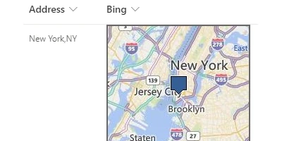
Transforming Address Information Tracking in SharePoint with Visual DashboardsTracking address information efficiently is an essential need within contemporary business environments, where precise and quick access to customer data, site locations, and other destinations is critical. SharePoint is often leveraged for this purpose due to its robust list management capabilities. However, a static list view can make data tracking monotonous and less intuitive. This is where the use of visual status indicators and dynamic dashboards, as provided by SharePointDashboards.com, comes into play. From mapping addresses using Bing Maps to enhancing project approvals and employee management tasks, these dashboards foster improved communication and efficiency.Enhancing SharePoint with Visual MapsCreating an engaging visual experience in SharePoint enhances how address data is tracked and viewed. By utilizing the Bing Maps template from SharePointDashboards.com, organizations can transform their list views into a dynamic map visualization. Simply applying the template to an address column within a SharePoint list brings the data to life on the screen. This is not only aesthetically pleasing but also practical, as it allows users to interpret geographic information quickly by viewing data points plotted on a map.Charting and Visual Status IndicatorsWithin the versatile landscape of SharePointDashboards.com, the ability to add visual indicators cannot be overstated. **Charting** provides a snapshot of data trends and patterns, allowing users to visually assess status changes and project advancements. By implementing dashboard items such as bar graphs, pie charts, and line graphs, SharePoint users can discern information at a glance. These dashboards are customizable and capable of accommodating various types of data, making them ideal for project approvals, where decision-makers need immediate insight into project status.Project Approvals and Employee ManagementDashboards facilitate smoother project approvals by providing a platform where all necessary information and updates are consolidated. When decision-makers have rapid access to real-time data visualizations, they can make informed decisions more efficiently, reducing time lags that could impact project timelines. Similarly, in employee management, having a comprehensive view of tasks, performance metrics, and other essential data points allows team leaders to manage their teams effectively, ensuring alignment with organizational goals.Improving Team Communication with Shared DashboardsThe incorporation of shared dashboards into a team's workflow dramatically enhances communication. These dashboards serve as a single source of truth where team members can access the latest information, updates, and data analytics. This unified communication platform reduces the chances of miscommunication and ensures that all team members are on the same page, leading to synergistic productivity and collaboration.Easy Dashboard Setup with SharePointDashboards.comOne of the appealing aspects of using SharePointDashboards.com is the simplicity and ease of setup. No installation is required; users can copy the desired map or chart template and paste it directly into their SharePoint list. This reduces the technical barrier to entry, ensuring even those with limited IT skills can deploy powerful data visualization tools. The services include an array of templates, including Google Maps and other graphical representations, making them versatile for any mapping needs.Use Case Scenarios for Critical Information UpdatesThe applications of these mapping templates are vast. For instance, a sales team tracking potential clients can visualize territories with customer addresses pinned on a Bing Map within SharePoint, highlighting areas of high interest or activity. Similarly, logistics teams can map out delivery routes and site locations, optimizing pathways and ensuring timely arrivals. Operational teams can utilize temperature maps to track site conditions in real-time, using dashboards to make prompt, informed decisions should issues arise.Understanding SharePoint JSON FormattingImplementing these visualization techniques in SharePoint often involves adjusting JSON formatting-a skill that allows further customization of list view visuals. JSON (JavaScript Object Notation) formatting in SharePoint modifies the visual representation of data without altering the data itself. Through SharePointDashboards.com, JSON formats are readily available in templates, which users can apply to format their SharePoint list views dynamically, transforming data rows into rich, engaging visual content.ConclusionIntegrating visual dashboards within SharePoint environments revolutionizes how address and site information is managed, transforming static lists into interactive maps. These tools cater to a wide array of needs from project approval processes to employee management, leveraging charting and mapping templates to enhance productivity and communication among team members. SharePointDashboards.com offers a seamless setup experience, expanding the potential of SharePoint's functionality without demanding technical expertise. With a plethora of templates accessible upon signup, it becomes easier for organizations to explore and implement these visual tools, driving better outcomes through informed decision-making.Watch a video to learn more:
|