Enhance Your SharePoint Site with Personalized Button Navigation - June 30, 2025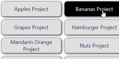
Enhancing SharePoint Sites with Button NavigationSharePoint has become an indispensable tool for organizations seeking to manage content, track workflows, and facilitate collaboration. The key to maximizing the potential of a SharePoint site lies in effective navigation, which guides users through complex data structures effortlessly. One of the most appealing and user-friendly methods to achieve this is through button navigation. The Button Navigation template available at SharePointDashboards.com simplifies setting up navigation buttons that enhance the user experience on your SharePoint site.Customizing Your Navigation ExperienceOne of the standout features of the Button Navigation template is its flexibility in customization. Users can configure the look and feel of navigation buttons to align with the organization's branding or personal preferences. Options to adjust font color, background color, hover color, and text styling are readily available. This customization is achieved via easy-to-use dropdown options and color pickers, making the process intuitive even for those with limited technical expertise.Simple Setup with SharePoint DashboardsImplementing button navigation on a SharePoint site is surprisingly straightforward, thanks to the templates available at SharePointDashboards.com. Users simply need to copy and paste the desired template directly from the website to their SharePoint site. This process eliminates the need for app installations or complex configurations, making it accessible for all levels of users. Moreover, new users can sign up to gain access to 21 free templates, allowing them to explore various navigation styles and functionalities.A Range of Navigation Templates AvailableBeyond button navigation, SharePoint Dashboards offers a plethora of navigation templates that cater to diverse needs. Whether you need a straightforward navigation menu or a complex sitemap, there's likely a template that fits your requirements. This variety ensures that your SharePoint site remains not only functional but also visually appealing and easy to navigate.Facilitating Communication with Shared DashboardsEffective communication is at the heart of successful team collaboration. Shared dashboards in SharePoint foster a transparent, unified view of projects and tasks, which enhances communication amongst team members. With shared dashboards, teams can track project status, identify bottlenecks, and allocate resources more effectively. This shared visibility ensures that everyone is on the same page, reducing misunderstandings and promoting efficiency.Use Cases for Updated Team CommunicationImagine a project team working on a critical product launch. A shared dashboard can be used to update team members with development timelines, marketing plans, and sales strategies. As changes occur, the dashboard provides a real-time update, ensuring that each team member has immediate access to the latest information. In another scenario, a human resources department can use a shared dashboard to track recruitment processes, onboard new employees, and manage departmental approvals. Such a setup keeps the entire team informed and engaged with ongoing tasks and changes.Project Approvals and Visual Status IndicatorsSharePoint dashboards can incorporate visual status indicators such as progress bars or traffic light symbols. These indicators provide at-a-glance insights into project statuses, making it easy for managers to assess progress and identify areas needing attention. Integrating project approval workflows into these dashboards further streamlines decision-making, as approvals can be tracked, managed, and documented in one centralized location.Employee Management and Status TrackingEmployee management becomes more effective with SharePoint dashboards, where tracking attendance, project contributions, and performance reviews can be visualized. Managers can oversee team workloads and adjust assignments based on real-time data, facilitating a more balanced and productive work environment.Setting Up Dashboards with SharePoint JSON FormattingCreating dynamic and visually appealing dashboards often involves SharePoint JSON formatting. By applying a template to a SharePoint list view, users can transform basic data structures into engaging, informative displays. JSON formatting enables customization such as conditional formatting, which can highlight key information based on specific criteria, thus enhancing the visual impact and usability of the dashboard. In conclusion, navigating a SharePoint site need not be cumbersome. With the help of navigation templates from SharePointDashboards.com, such as the Button Navigation template, setting up user-friendly, customized navigation is a quick and easy task. These enhancements not only improve the user experience but also facilitate better communication and management within teams. By utilizing shared dashboards, project approvals, status tracking, and JSON formatting, organizations can make the most out of their SharePoint environments, leading to more efficient and successful outcomes.Watch a video to learn more:
|