Introduction
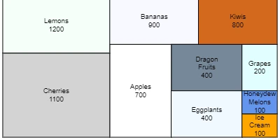
Area Charts offer a visually appealing and efficient alternative to traditional Pie Charts for displaying proportional data. Widely used in corporate and organizational settings, Area Charts can be a valuable addition to SharePoint sites for various applications ranging from project approvals to employee management. The charm of Area Charts lies in their ability to use rectangles, instead of pie wedges, to depict proportional values, thereby providing a more sophisticated and easily readable visual indicator. This article will explore the versatility of Area Charts, their integration with SharePoint, and how they enhance inter-team communication through shared dashboards.
The Role of Area Charts in Charting
Area Charts provide a graphical portrayal of data where rectangles represent different categories in proportion to their corresponding values. This approach is not only visually appealing but also practical for illustrating data distribution in corporate settings. Here are some key benefits of using Area Charts:
- Visualization of Complex Data: These charts can break down large datasets into manageable visual components, helping teams understand intricate data relationships at a glance.
- Efficiency in Project Approvals: By representing data in a clear and concise manner, Area Charts can expedite the project approval process by providing decision-makers with transparent data visualizations.
- Employee Management: They can be used effectively to track employee performance metrics, visualize workload distributions, and strategize workforce management.
- Status Tracking: Area Charts facilitate real-time status tracking by providing dynamic data updates that team members can access easily.
Enhancing Communication with Shared Dashboards
Shared dashboards present a consolidated visual space where all team members can access real-time data and updates. Using Area Charts within SharePoint Dashboards helps to streamline communication in the following ways:
- Transparency: Dashboards ensure that all team members have access to the same data, eliminating inconsistencies and miscommunications.
- Collaboration: With shared dashboards, team members from different departments can collaborate effectively by focusing on unified goals.
- Decision Making: Access to visual data aids teams in making informed decisions quickly.
- Customization: Teams can customize dashboards to align with their specific needs, keeping everyone in sync with relevant information.
Setting Up an Area Chart in SharePoint
Integrating an Area Chart in your SharePoint site is straightforward, thanks to the resources available at
SharePointDashboards.com. To set up:
- Access Templates: Begin by signing up with your name and email to access 21 free charting templates.
- Choose Your Chart: Select from over 35 different charting options available, with the Area Chart being one of the most effective for proportional data representation.
- Customization Options: Customize the appearance of your Area Chart by adjusting colors, borders, fonts, and sizes to fit your company's branding and visual identity.
- Easy Integration: Simply copy and paste the template directly into your SharePoint site to get started.
Understanding SharePoint JSON Formatting
In SharePoint, JSON formatting can transform a basic list view into a rich, interactive visual display. Using a template to apply JSON formatting allows users to:
- Enhance Data Presentation: Present list items in dynamic formats with colorful data bars, icons, and conditional styling.
- Interactive Elements: Add interactive elements that enhance the user's ability to engage with the data presented.
- Efficiency: Pre-designed templates simplify the application of JSON formatting, allowing users to achieve consistent looks and functionalities with minimal effort.
Use Case Scenarios
Area Charts in SharePoint are applicable in a myriad of organizational scenarios. Below are a few practical use cases:
- Project Management: Project managers can track the progress of various projects in real-time, with shaded areas determining resource allocation or project completion percentages.
- Sales Performance: Sales teams can visualize employee performance and sales targets, using Area Charts to depict quarterly or yearly achievements.
- HR Analysis: Human Resources departments can monitor workforce demographics and turnover rates, using the visual impact of area charts for better strategic planning.
- Resource Allocation: In operations, Area Charts can depict the distribution of resources across different departments or functional units within a company.
Conclusion
The integration of Area Charts into SharePoint dashboards not only enhances the visual clarity of complex data but also propels interdepartmental communication and collaboration. With the convenience of pre-designed templates from SharePointDashboards.com, setting up compelling Area Charts on your SharePoint site has never been easier. By utilizing these visual tools, organizations can ensure data transparency, improve project approvals, and foster an environment of informed decision-making. Whether you're managing teams or tracking project statuses, Area Charts provide the visual leverage needed to align team efforts with organizational objectives effectively.