Create an Engaging Waterfall Chart for Your SharePoint Site - July 1, 2025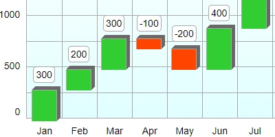
Using Waterfall Charts for Enhanced Project ManagementA waterfall chart is a specialized type of bar chart that comes with unique properties, allowing teams to visualize data sequentially. Unlike the standard bar chart, the waterfall chart shows incremental changes across datasets, effectively highlighting growth patterns, market trends, or financial reports. This powerful visualization tool is available for download at SharePointDashboards.com, where users can customize the chart's aesthetics and directly embed it within their SharePoint lists. This article explores how waterfall charts fit seamlessly into project management, especially concerning charting, visual status indicators, project approvals, employee management, and status tracking.Charting and Visual Status IndicatorsIn project management, visual clarity is paramount. Waterfall charts offer a clear depiction of cumulative value over a specific timeline, which makes them ideal for illustrating the progress of a project over months or quarters. The waterfall format ensures every incremental change is visible, allowing project managers to quickly identify key phases and transitions in ongoing projects. This is especially useful when tracking performance metrics that require detailed observation, such as monthly sales data or quarterly financial performance.Project Approvals and Employee ManagementProject approvals often hinge on clear, concise data presentations. Waterfall charts can illuminate the overall project trajectory at a glance, allowing stakeholders to understand the project's status quickly. This transparency aids in gaining faster approvals as decision-makers can clearly see the rationale behind the numbers. Furthermore, employing waterfall charts can be beneficial in employee management by tracking individual or team contributions to overall goals, highlighting each person's impact on the cumulative results.Status TrackingStatus tracking is another area where waterfall charts excel. By providing a detailed breakdown of progress over set intervals, these charts allow managers to track milestones, resource allocation, and timelines, facilitating better planning and timely adjustments. Waterfall charts can be programmed to alert team members of potential delays or discrepancies, ensuring any issues are promptly addressed.Improved Team Communication Through Shared DashboardsA shared dashboard enhances team communication by providing a centralized platform for data sharing and status updates. When every team member can access the same updated visuals, it eliminates misunderstandings and aligns the team towards common goals. Waterfall charts incorporated into SharePoint dashboards are particularly effective for communicating project timelines, expected outcomes, and identifying areas needing immediate attention. This collective visibility fosters a collaborative environment where everyone is informed and empowered to contribute effectively.Setting Up in SharePointCreating a dynamic and informative SharePoint dashboard with a waterfall chart is streamlined using a simple copy-and-paste method. SharePointDashboards.com offers a user-friendly template where you can input your data, customize the waterfall chart's design, and then integrate it within your SharePoint environment. This integration requires no specialized knowledge, thanks to the intuitive tutorial video guiding new users through each step.Use Case ScenariosImagine a project manager who needs to brief the executive team on the monthly sales performance over the past year. With a waterfall chart, the manager can convey the month's beginning and end inventory, sales fluctuations, and revenue milestones succinctly. Similarly, in a manufacturing setting, waterfall charts can track productivity metrics like units produced, leading to more informed operational decisions.Understanding SharePoint JSON FormattingSharePoint JSON formatting is a powerful way to enhance list views by applying customized styling and logic. Creating a waterfall chart within SharePoint involves applying a template to the SharePoint list view, utilizing JSON to bring the chart layout into functionality. JSON templates dictate the presentation, allowing you to shape the data visually to suit specific reporting needs. This customization ensures that every user's view is optimized for their specific informational requirements.ConclusionWaterfall charts provide an invaluable tool for rendering complex data in an easily digestible format. Through SharePoint, teams can access an array of over 35 diverse charting options, ensuring the availability of templates suitable for any business requirement. By leveraging the ease of template usage, teams can focus on making data-driven decisions that drive project success. Whether it's a new user leveraging the 21 free templates offered or an experienced team integrating advanced visualizations, waterfall charts on SharePoint Dashboards bring clarity and efficiency to the forefront of project management.Watch a video to learn more:
|